Technologies Reimagined - Direct Dose
As part of the Technologies Reimagined group project, I developed the logo and core concept for a reimagined medication delivery system aimed at improving accessibility for people who are elderly, disabled, time-poor, or unable to leave their homes. Our team explored both the opportunities and limitations of this idea, particularly around medication safety and security. In response, I proposed a locked delivery box system that could only be accessed by the recipient using an embedded chip-based tool, ensuring privacy and controlled access. Once unlocked, the box would be collected by drivers, creating a seamless and secure exchange. The concept was positioned as a potential partnership with Uber, expanding its service capabilities while creating new job opportunities for drivers. The logo was designed to reflect trust, accessibility, and innovation, capturing the intersection of technology, care, and everyday life.

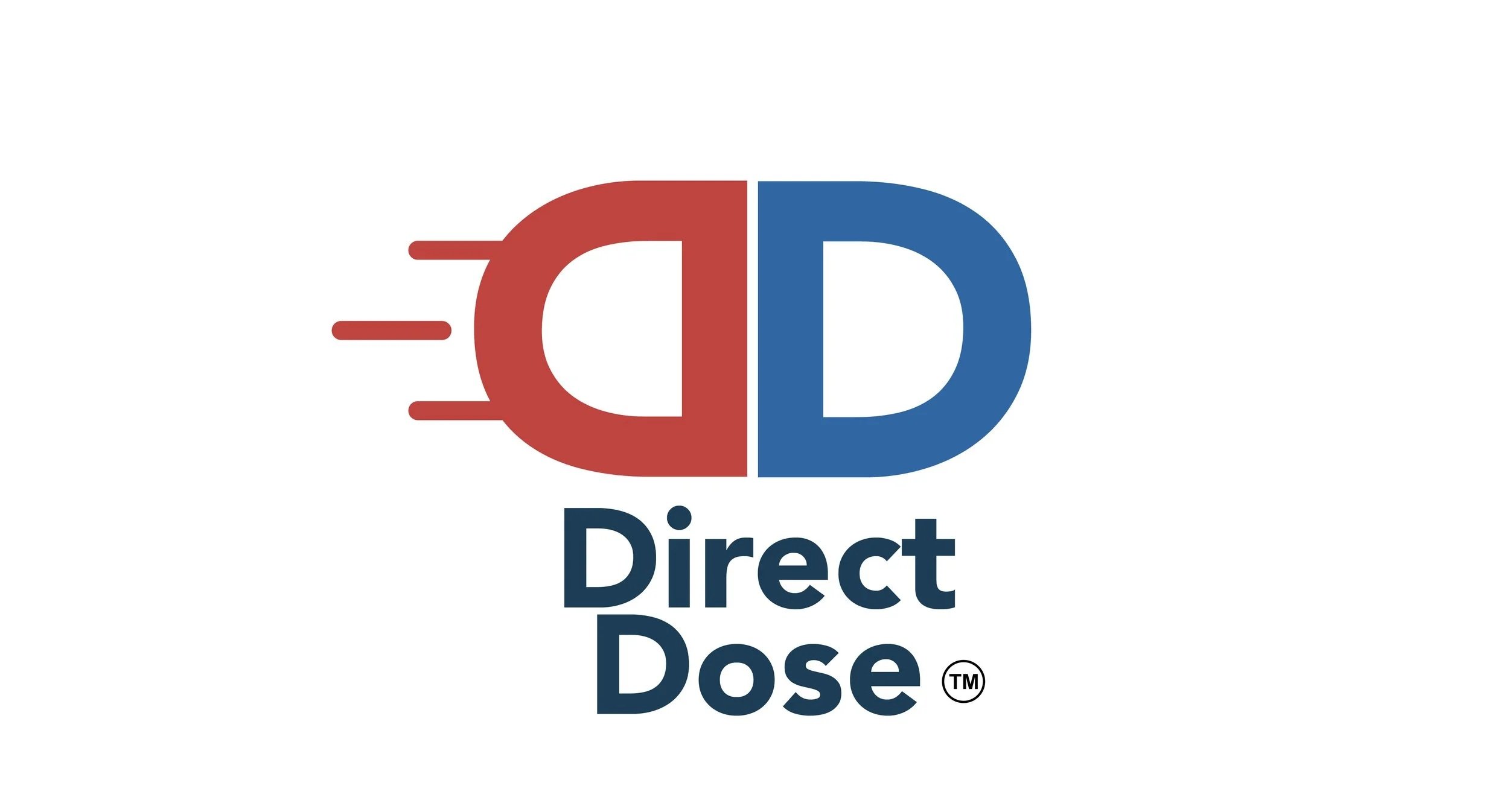
The Direct Dose logo was designed to visually communicate speed, trust, and accessibility within healthcare delivery. The double “D” form is constructed using simple, rounded shapes to reference a pill capsule, reinforcing the core function of medication distribution while maintaining a clean, modern aesthetic. The colour palette combines blue and red to balance trust and care with urgency and action with blue commonly associated with healthcare, reliability, and safety, and red signalling immediacy and directness. The horizontal lines extending from the red “D” suggest motion and delivery, visually anticipating the word Direct and reinforcing the idea of fast, efficient service. The name Direct Dose reflects the brand’s purpose: a straightforward, secure connection between medication and the individual, removing barriers and delays while prioritising user safety and ease of access.


