A curated trio of powdered health blends designed to integrate seamlessly into smoothies, juices, and everyday rituals. Each formula supports a different aspect of holistic wellbeing, energising the body, balancing the mind, and restoring inner vitality through natural, nutrient-rich ingredients. The minimalist packaging reflects a clean and honest approach to wellness, pairing thoughtful design with functional clarity to communicate transparency, purity, and intentionality.
Brand Identity | Logo Design | Visual Direction
Whole Health Co was developed as a holistic wellness brand centred around the connection between mental and physical wellbeing. The concept, “for a healthy mind and body,” guided every design decision from naming to logo construction and application.
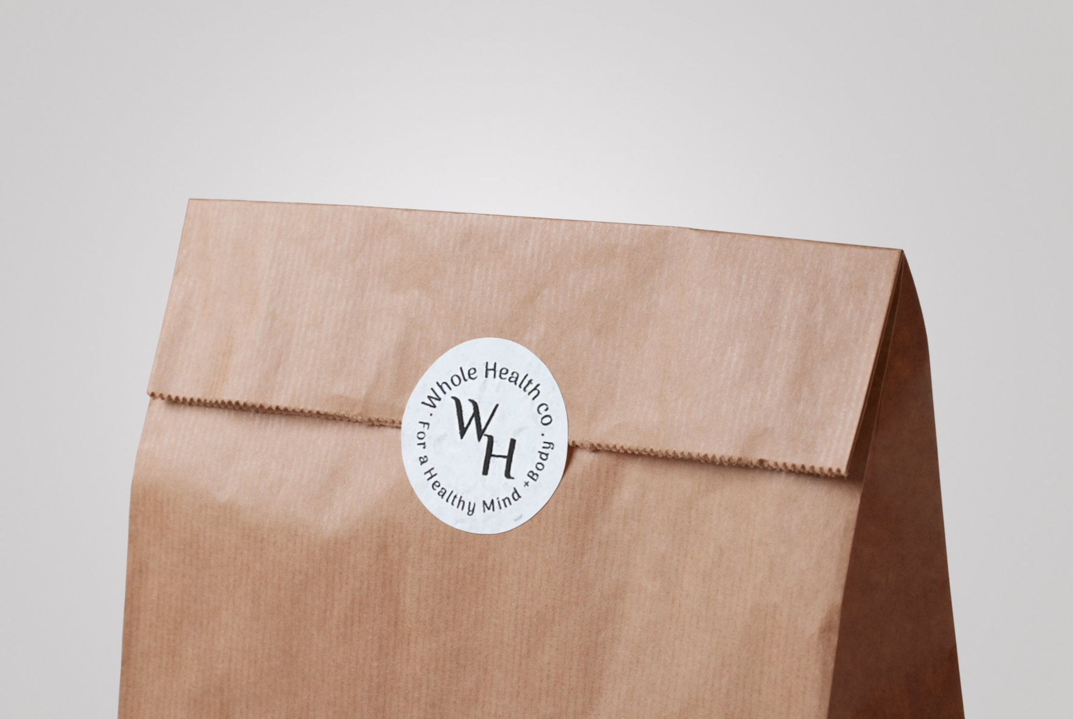
The brand identity was designed to feel grounded, calm and trustworthy. I chose a minimal circular logo mark to symbolise unity and wholeness, reflecting the brand’s philosophy that health is not fragmented, but interconnected. The central “WH” monogram creates a strong, recognisable anchor, while the surrounding typography reinforces the brand name and tagline in a balanced, cohesive form.
The visual direction leans into natural tones and tactile materials, as seen in the kraft paper packaging application. This choice reinforces ideas of sustainability, earthiness and authenticity, values aligned with holistic health practices. The restrained colour palette and clean typographic treatment ensure the brand feels timeless rather than trend-driven.
Through this project, I explored how subtle design decisions like shape, spacing, materiality and tone can communicate trust and care within the wellness space. Whole Health Co demonstrates my ability to build a considered, cohesive brand identity that translates seamlessly across all areas.
Whole Health Co | For a Healthy Mind & Body
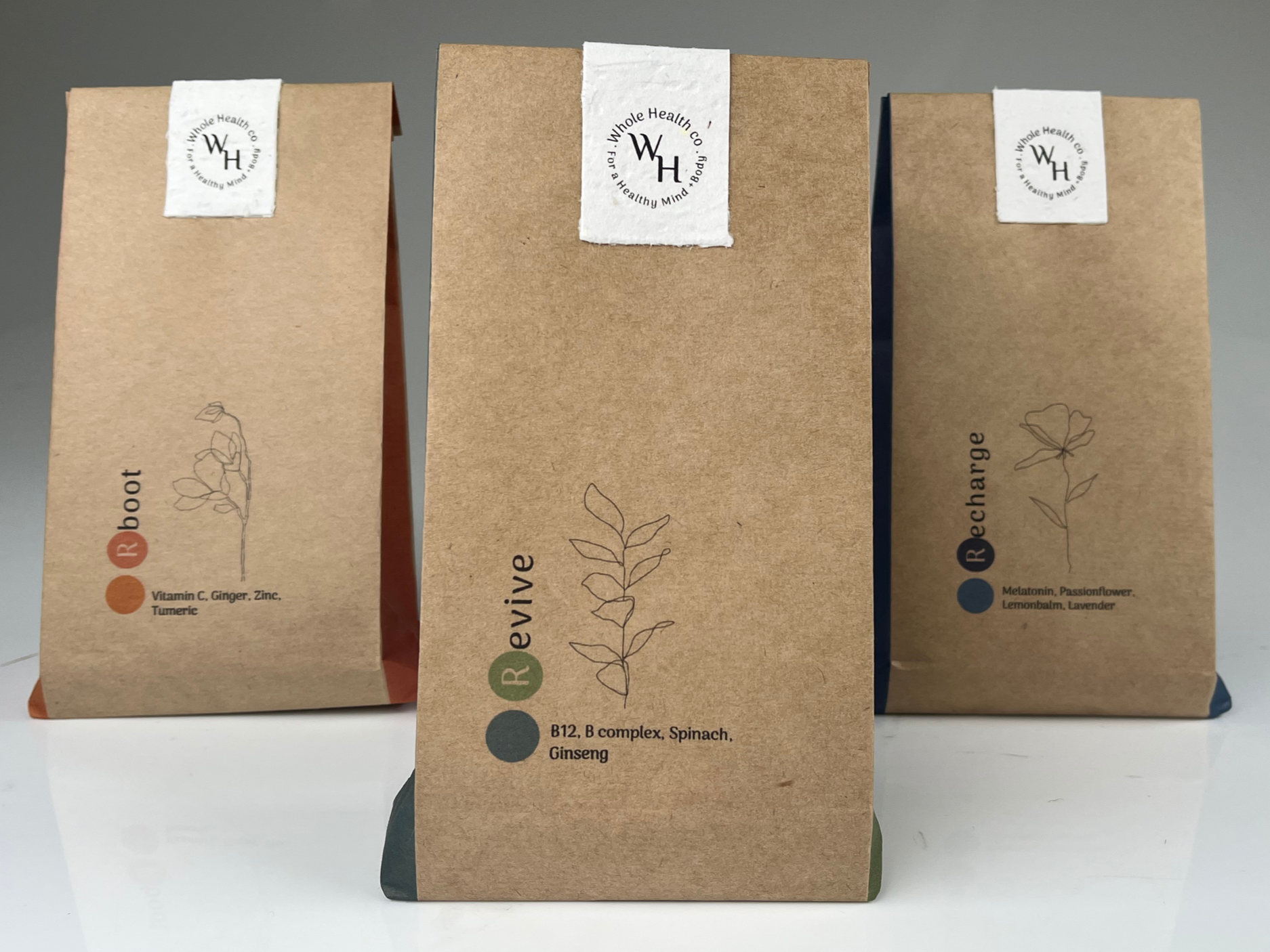
Revive was developed as the energising blend within the Whole Health Co range, formulated to support sustained vitality and mental clarity. Featuring B12 and B complex vitamins to assist energy production, ginseng to enhance focus and stamina, and spinach as a natural source of iron and antioxidants, the blend is designed to gently restore and uplift without relying on synthetic stimulants. The ingredient transparency reflects the brand’s commitment to whole, honest nutrition, supporting the body in a way that feels balanced rather than extreme. Visually, the minimalist packaging and botanical line-work reinforce the natural origins of the formula, aligning the product seamlessly with Whole Health Co’s philosophy of nurturing both mind and body through considered, holistic design.
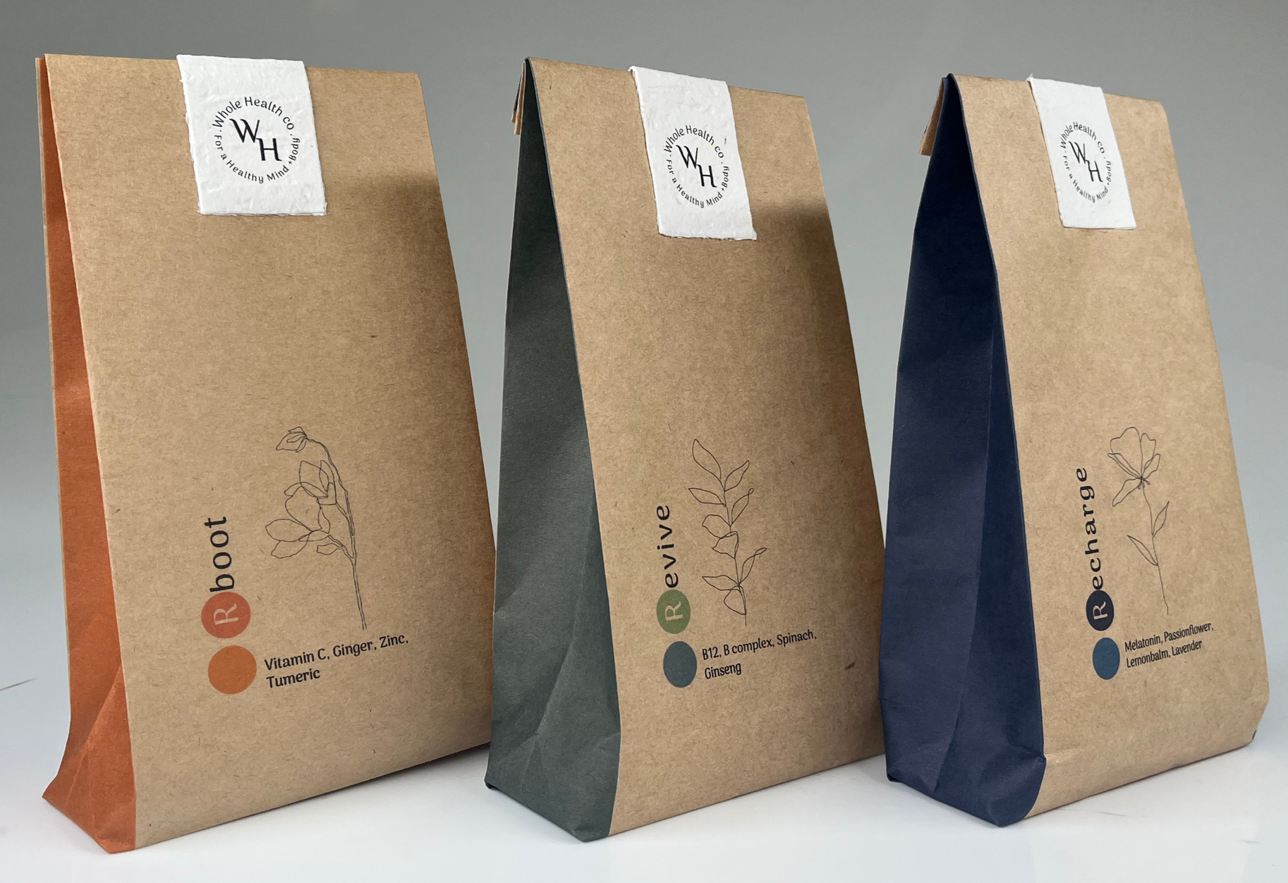
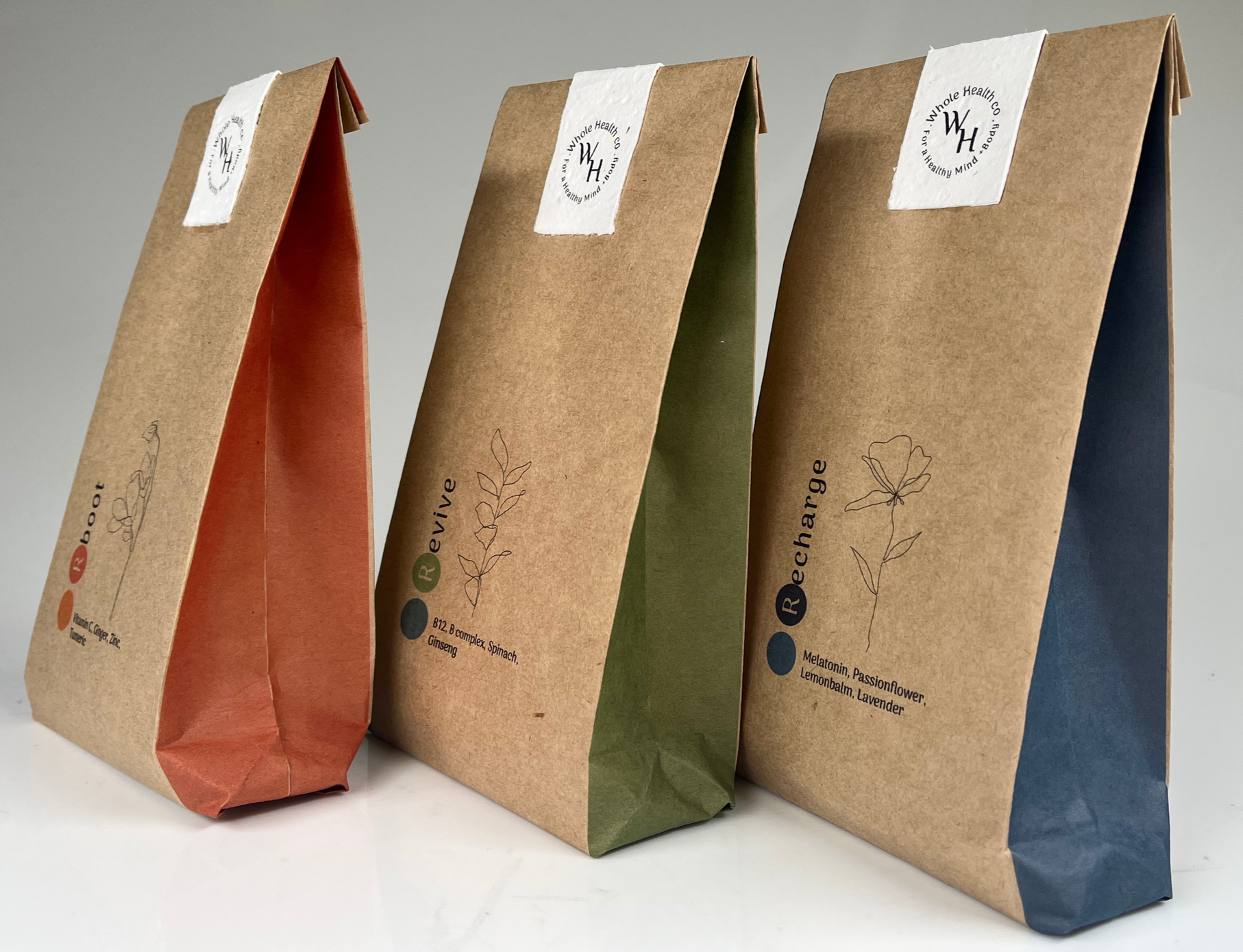
Recharge was designed as the restorative blend within the Whole Health Co collection, supporting relaxation, nervous system regulation and restful sleep. Formulated with melatonin to assist natural sleep cycles, passionflower and lemon balm to calm the mind, and lavender to gently ease tension, the blend encourages a slower rhythm at the end of the day. Rather than promoting sedation, Recharge aligns with the brand’s holistic philosophy by supporting the body’s existing processes in a balanced, natural way. The soft botanical linework and muted blue accent reflect tranquillity and stillness, visually reinforcing the product’s purpose. As with the broader range, the minimalist packaging and transparent ingredient listing communicate trust, simplicity and Whole Health Co’s commitment to nurturing both mind and body through thoughtful design.
Reboot was developed as the immunity-support blend within the Whole Health Co range, formulated to strengthen and protect the body through nutrient-dense, anti-inflammatory ingredients. Combining Vitamin C and zinc to support immune function, alongside ginger and turmeric known for their natural anti-inflammatory and antioxidant properties, the blend is designed to help the body reset and defend itself during periods of stress or seasonal change. In alignment with the brand’s holistic philosophy, Reboot focuses on prevention and nourishment rather than quick fixes. The clean botanical illustration and warm accent tones reflect vitality and natural strength, while the minimalist packaging reinforces transparency and purity. Together, the formulation and visual identity embody Whole Health Co’s commitment to supporting long-term wellbeing through thoughtful, considered design.
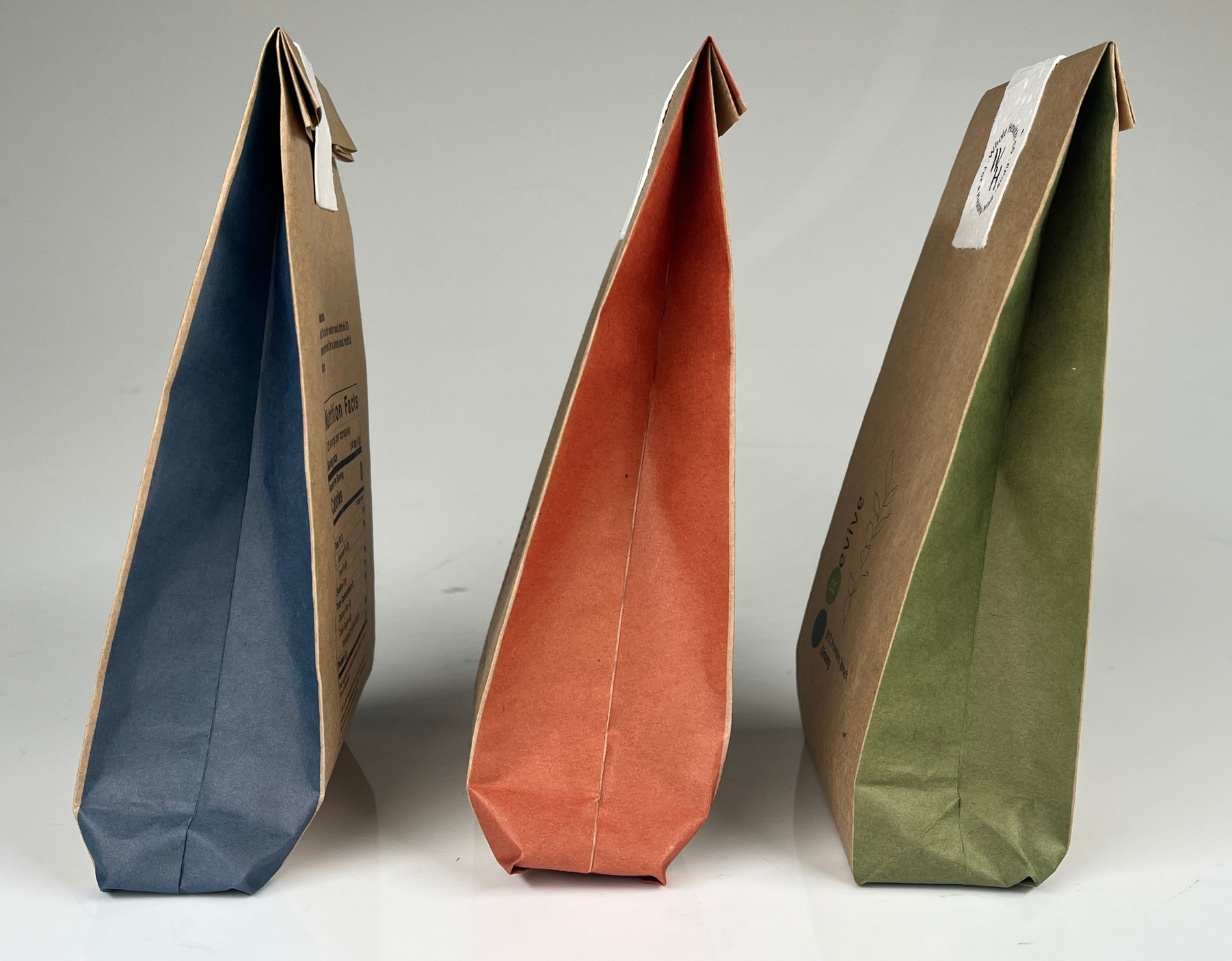
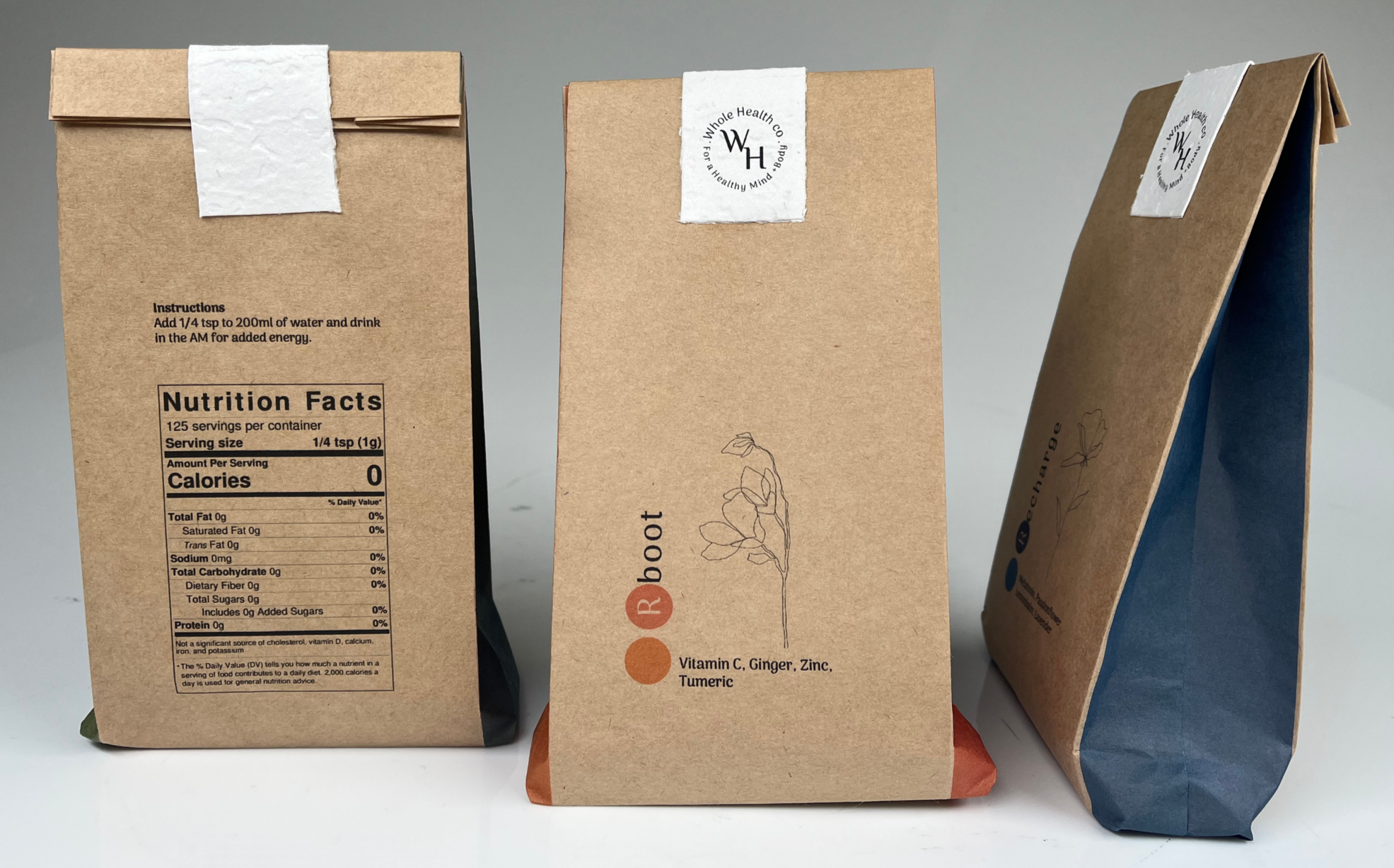
The packaging for Whole Health Co was intentionally handcrafted, with each form hand-folded to create a soft, structured silhouette that feels considered rather than mass-produced. This tactile construction reinforces the brand’s emphasis on care, intention and human connection within the wellness space. Each package features a contrasting internal seam colour, revealed subtly through the folds, creating a quiet moment of discovery when handled. These internal tones directly correspond with the two-toned circular markers on the exterior of each pack, visually linking the interior and exterior design. This detail-driven approach creates cohesion across the range while allowing each product to maintain its own identity, reflecting the balance between individuality and wholeness that underpins the Whole Health Co brand.