This project involved collaborating with EDCC (Eating Disorder Carers Counselling) to develop a brand identity and logo that authentically reflected their mission and values. Working closely with the client, the goal was to create a visual identity that conveyed trust, compassion and professionalism, while acknowledging the sensitivity and complexity of supporting carers of individuals with eating disorders. The branding needed to feel safe and supportive, yet strong and credible within the mental health space. Through research, consultation and iterative design, I developed a considered identity that aligned with EDCC’s purpose and audience.
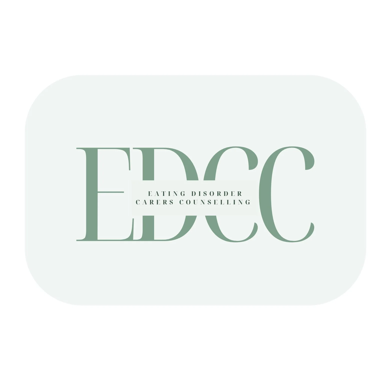
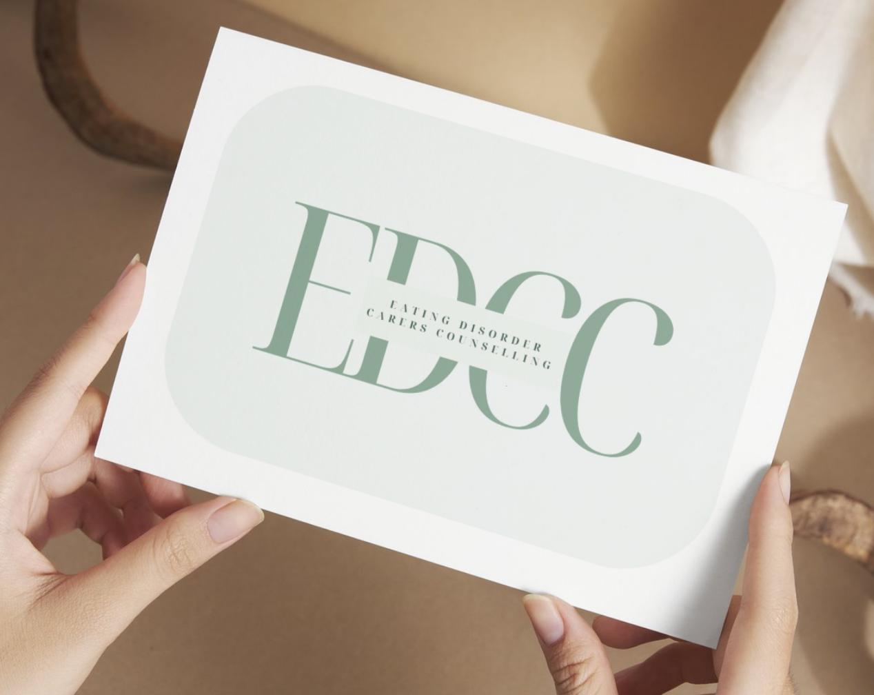
The EDCC logo was designed to balance strength with sensitivity. The oversized serif acronym “EDCC” creates a bold, confident foundation, establishing credibility and authority within the mental health space. In contrast, the full name ‘Eating Disorder Carers Counselling’ is set in a refined, widely spaced type treatment that softens the composition and introduces clarity and professionalism. The interplay between scale and spacing symbolises the relationship between carers and those they support, strength holding space for vulnerability. The muted sage green palette was intentionally selected to evoke calm, reassurance and growth, aligning with themes of healing and emotional safety. The overall minimal composition ensures the brand feels contemporary and trustworthy, allowing the organisation’s mission to remain the focus while the design quietly reinforces stability and care.
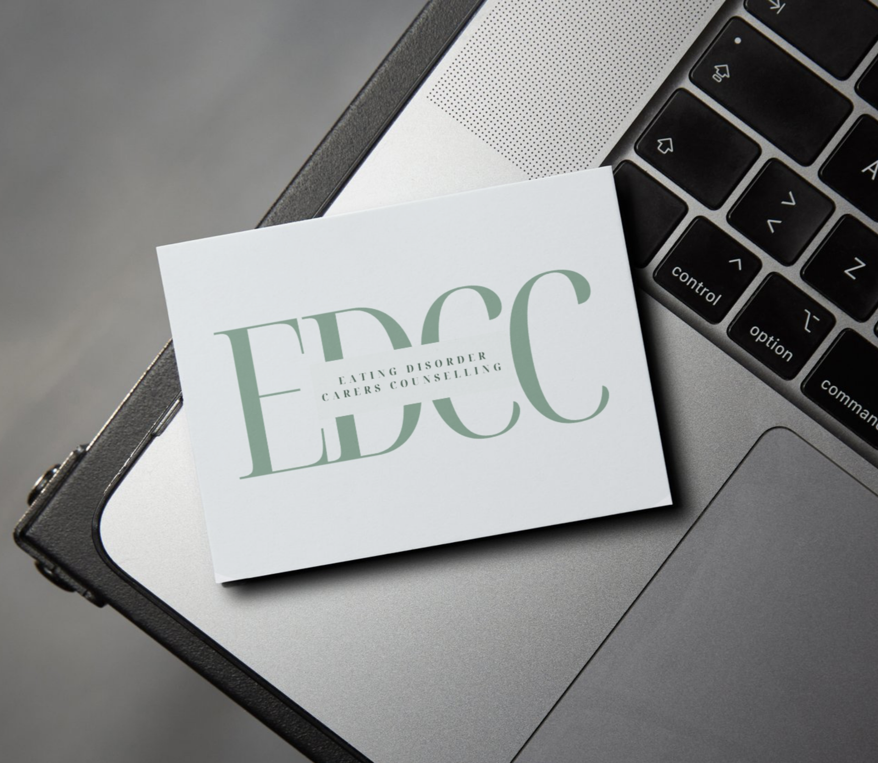
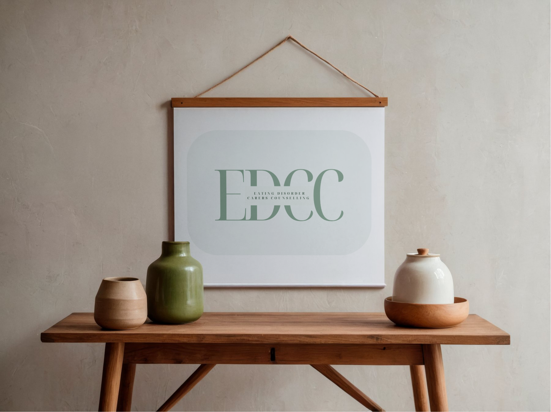
The logo was designed with versatility and longevity in mind, ensuring it translates seamlessly across both digital and print platforms. Its clean, typographic structure allows it to scale effectively from website headers and social media assets to business cards and formal documentation without losing clarity or impact. The strong acronym can stand alone as a recognisable mark when space is limited, while the full name lockup maintains professionalism in more formal contexts. The restrained colour palette ensures consistency across screen and print reproduction, reinforcing brand cohesion. This adaptability strengthens EDCC’s presence, allowing the organisation to communicate with confidence across multiple areas while maintaining a sense of calm and credibility.